Framer
Framer Components 101: A Beginner’s Guide
In this guide, I'll break down exactly how Framer components work, show you practical applications that I use in my day-to-day, and share the time-saving techniques that have allowed me to build a sustainable design business.

Hamza Ehsan
Web Designer & Entrepreneur

Framer components are the secret weapon in any designer’s kit.
After creating dozens of premium templates and generating consistent five-figure monthly revenue, I've learned that mastering components isn't just helpful — it's essential for an efficient design workflow.
I always emphasize components first.
They're the difference between spending 30 minutes on a design change versus 3 hours of updates across multiple screens.
In this guide, I'll break down exactly how Framer components work, show you practical applications that I use in my day-to-day, and share the time-saving techniques that have allowed me to build a sustainable design business.
I’ve even included a few mini-tutorials to get you started.
Let’s get into it.
What Are Framer Components?
Framer components are reusable design elements that you can create once and use across your entire project. Think of them as building blocks that save you from recreating the same elements repeatedly.
At their core, components maintain consistency while streamlining your workflow.
There are several types of components you might work with:
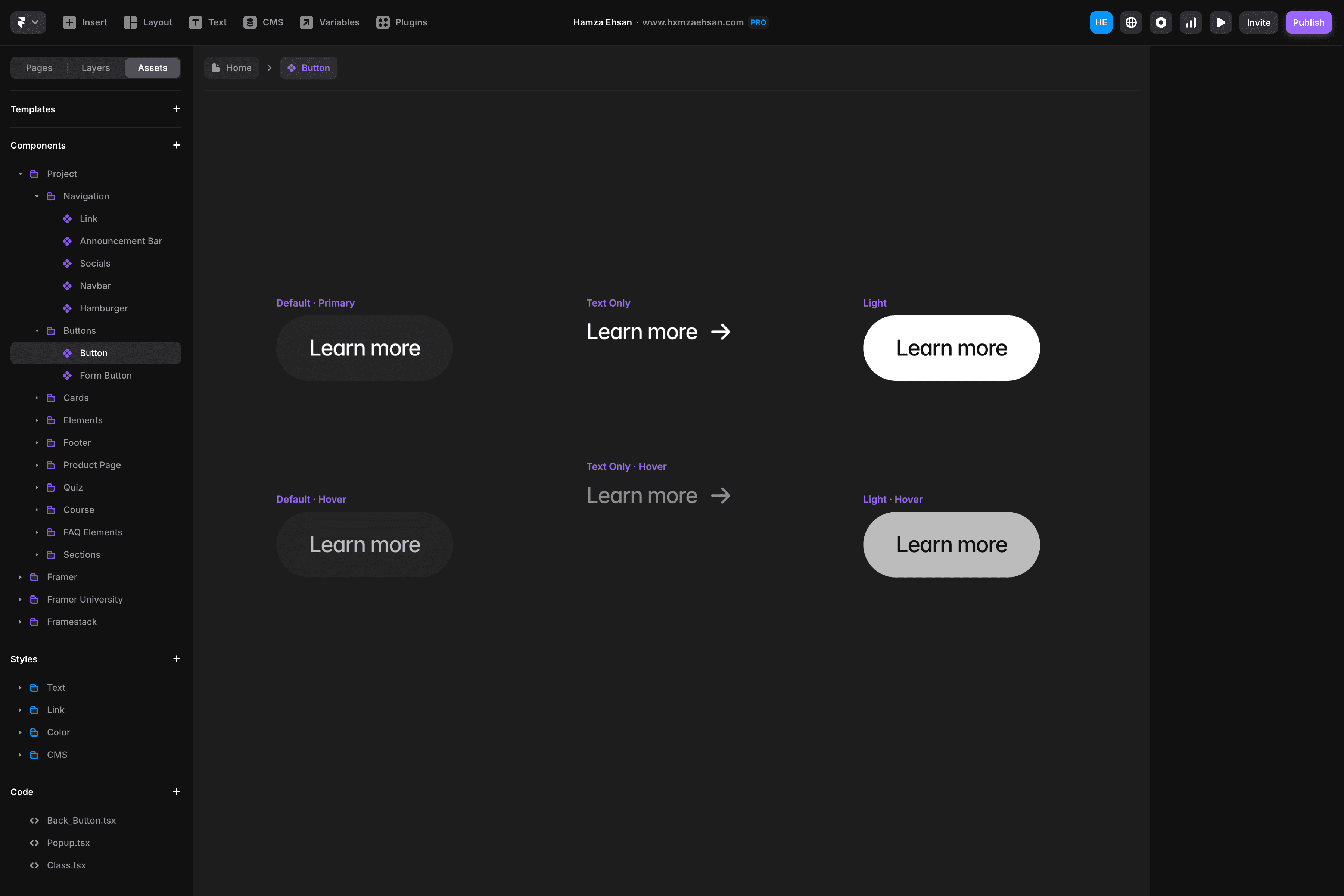
Basic components: Buttons, cards, and other UI elements
Interactive components: Elements with hover states, animations, and other user interactions
Responsive components: Designs that adapt to different screen sizes
Code components: Custom functionality built with React
They can be used for almost everything from navigation menus, feature sections, testimonial displays, and contact forms, and allow for near-endless customizable options.
How to Make a Component In Framer
Here I’m going to show you how to add a component in Framer. We’re not going to do anything crazy just yet, we’ll just add a basic component and play around with the settings for familiarity.
Follow along with me:
Choose a basic element you want to turn into a component. For this example, let's use a button with text and styling.
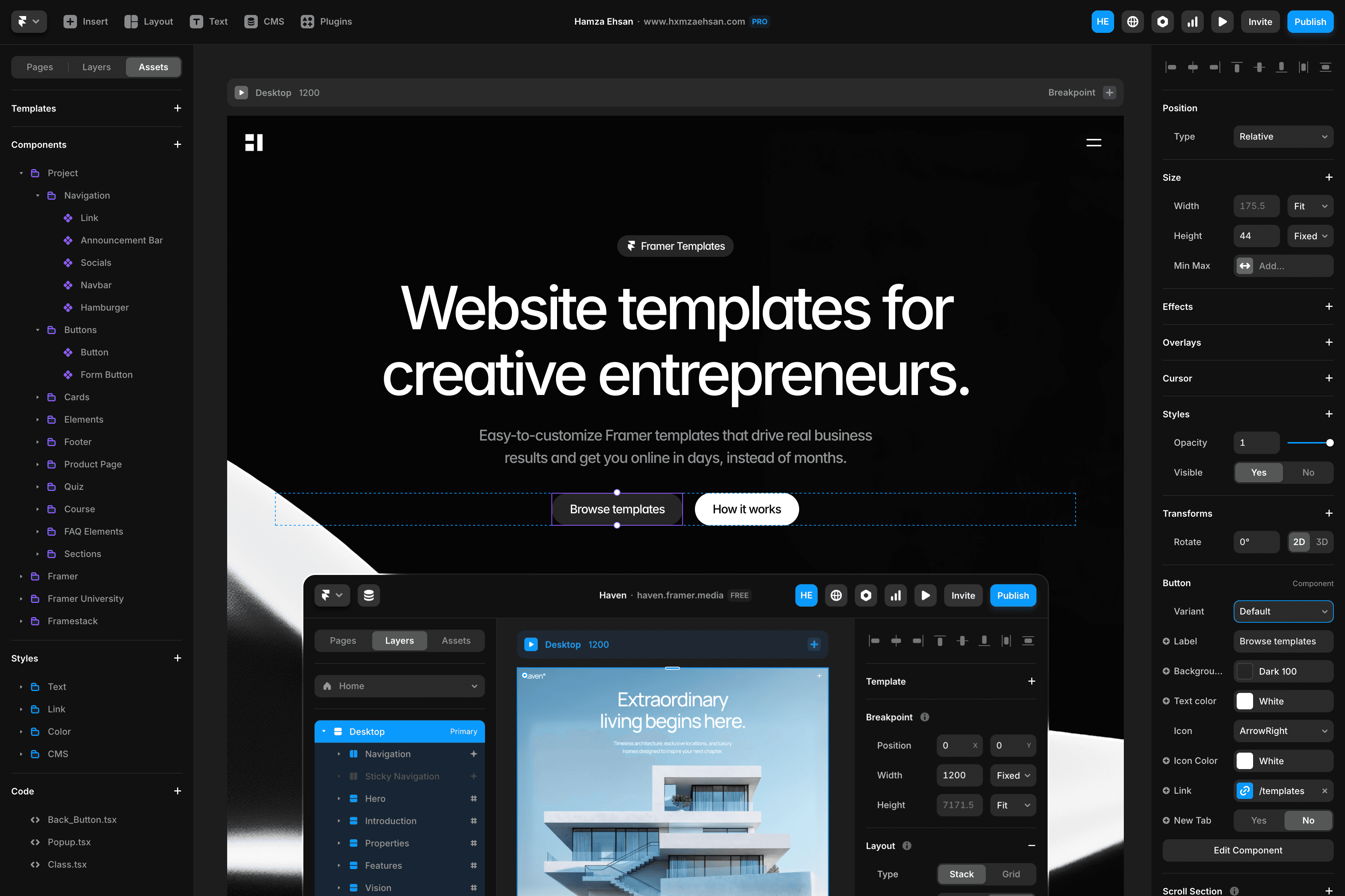
Select your element, then press Command+K (or Ctrl+K on Windows) to bring up the quick actions menu.
Select "Create Component" and give it a name.
Framer will take you to the component canvas – a dedicated workspace for editing components.
Play around with the options, and make a few edits to your component. It doesn’t matter what at this stage – we’re just getting used to moving around the space here.
When you're done, use the navigation to return to your main canvas. Your new component should now have a purple outline when selected.
Try duplicating your component by copying and pasting it or using Alt+Drag. Each copy is connected to the original.
Now, double-click to enter the component canvas again. Make a change to the text or style, and return to the main canvas. If you’ve followed each step correctly, your original and your duplicate should match.
I’d recommend starting with simple components like buttons, cards, or headers and playing around with the settings.
Once you feel comfortable with the workflow, you can move on to the next section below.
Using Variants
Variants let you create different states of a component that you can switch between — perfect for interactive sites.
Let’s change your first variant:
Double-click your component to enter the component canvas.
Click the "+" icon in the variants section on the right panel.
Name your variant something descriptive like "Hover" or "Active."
Change your new variant with different colors, scale, or opacity.
Play with the animation settings for smooth transitions between variants.
You can add interactions by selecting your variant, pressing "L," and connecting it to another variant.
Set some triggers, like "On Hover" or "On Tap", in the interaction panel.
Product cards are a great place to use variants. You could create normal, hover, and "sold out" states – this keeps it all consistent while allowing the visuals to change.
Quick tip: Variants inherit properties from their primary variant, so make sure you’ve made all of you structural changes to the primary first, before customizing individuals.
Using Variables
Variables take your Framer components to the next level by making them truly adaptable.
While variants give you predefined states, variables let you customize each property for each component.
When I’m building complex components, I like to use variables for properties that need to change frequently across instances — like colors, text, or spacing.
Here’s how:
Double-click your component to enter the component canvas.
Select an element or property you want to make variable, like a fill color.
Click the "+" icon next to the property in the right panel.
Name your variable something clear, like "Background" or "Heading."
Set the default value that will apply unless overridden.
When you go back to your main canvas, the variables will appear as adjustable properties for each component.
This means you can have multiple buttons that share the same structure, but display different colors and text.
Variables are really useful for components that need to maintain consistent behavior in different contexts.
Building Responsive Components
Let's talk about making components respond to different devices.
This is something I think most designers struggle with at the beginning, so don’t worry if it takes a little while to get your head around it all.
Here are some tips:
When in the component canvas, set text elements to "Auto Width" so they'll adjust based on their content.
For frames, ditch fixed pixel values and use flexible options instead:
"Fill" makes elements expand to fill available space
"Fit" wraps perfectly around what's inside
"Relative" uses relative sizing that adapts to the container
Convert regular frames to stacks when you need elements to flow in a specific direction and wrap properly.
Use padding instead of fixed positioning – this is the key difference between a component that breaks and one that adapts.
Add constraints to determine how elements behave when their container changes size.
Responsive components are all about relationships.
Instead of thinking “this button is 200px wide”, think about how much space it takes up. Eg. “This button takes up 50% of its container”.
You can test everything using Framer's device preview mode before you go live.
Mini-Project Tutorials
Let's try building a few practical components together. These mini-projects will help you apply what you've learned and get some hands-on experience with Framer components.
Toggle Switch
Create a small rectangle (60px × 30px) with rounded corners.
Add a circle (28px × 28px) on the left side of your rectangle.
Select both shapes and turn them into a component (Command+K).
Add a second variant called "On".
In this "On" variant, move the circle to the right side and change the background color.
Create interactions by connecting each variant to the other when tapped.
Tabbed Content Block
Create a row of text labels to serve as your tabs.
Add a content section below with your first tab's information.
Select everything and convert it to a component.
Create additional variants for each tab's content.
Set up each tab to show its corresponding content when clicked.
Preview your design to test the tab switching.
Accordion
Make a header with a question and a plus icon.
Add your answer text below.
Turn this into a component.
Create a variant called "Expanded".
In the Expanded variant, rotate the plus icon to form an X.
Make the answer visible in Expanded and hidden in the Default state.
Connect the variants so clicking toggles between states.
Once you've mastered these basics, you'll can play around with different ways to combine and extend them for your own projects.
Premium vs. Free Framer Components
The Framer Community has hundreds of free components you can download instantly, from buttons to interactive elements. I've found navigation menus and form components particularly useful as starting points.
Premium component libraries, though, can be a huge advantage above them.
The best paid for components include things like documentation, responsive designs, and variables that make customization quick.
Before you buy, check if the components use proper Framer techniques like variants and variables rather than just static designs – it makes all the difference when you try to adapt them to your specific needs.
You can then add all of your favorites into your own library.
I drag my most successful components into a dedicated "Components" page in my main Framer file, making them easy to copy into new projects. This practice has probably saved me hundreds of hours over the past year.
Quick Reference: Let’s Recap
Here's the breakdown of what we've covered about Framer components:
Components are reusable: Create once, use everywhere, update in one place.
Variants create states: Variants help you build hover effects, active states, and different visuals.
Variables make things flexible: Variables let specific properties be customized per instance
Consider responsive design: Components can adapt to any screen size
Use existing resources: Free and premium components can speed up your workflow
I've found that the biggest productivity jump in any project actually comes from simply changing how you think about design.
Instead of seeing a page as a collection of elements, think of it as a system of reusable components.
And if you're looking for somewhere to start, my collection of premium Framer templates is designed specifically for customization no matter your project. Each one comes with documentation, a walkthrough for usage, and support if you get stuck.
Check out my template store here.